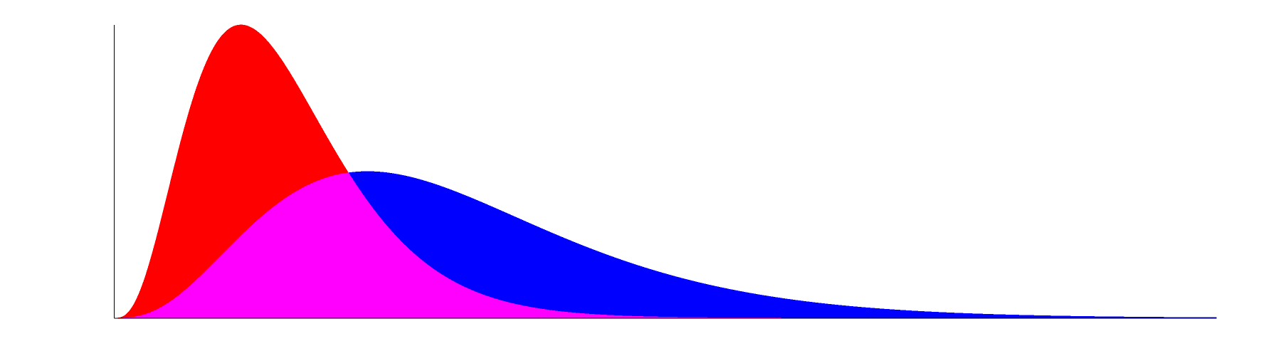
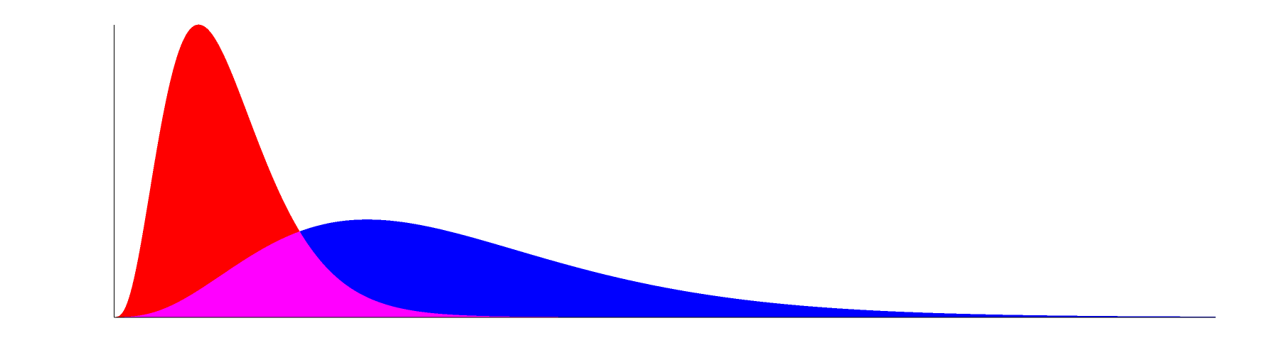
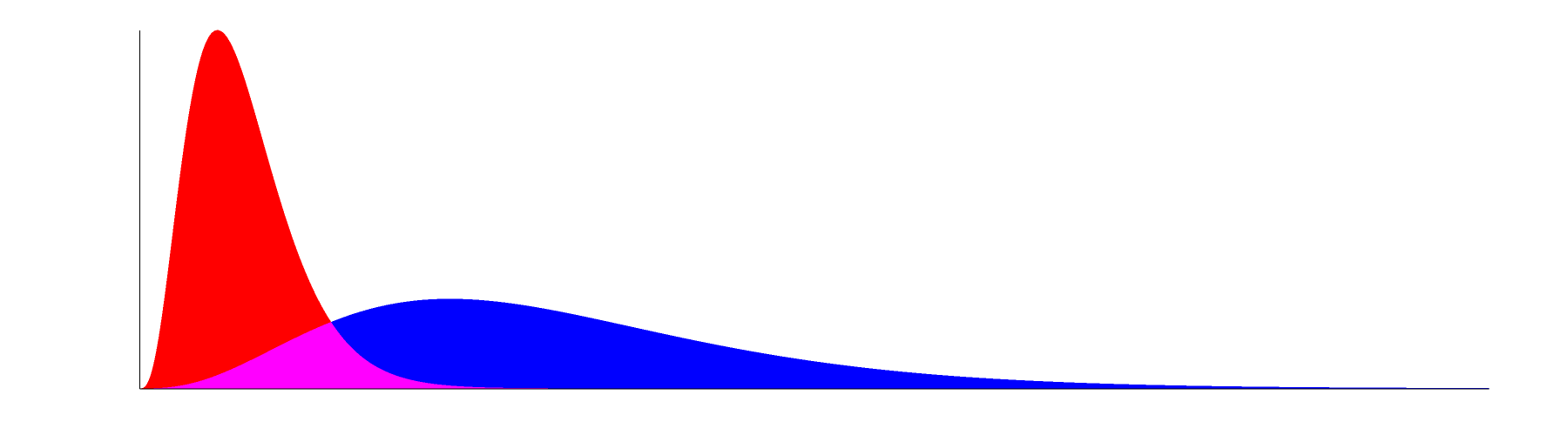
Here are some pictures of pairs of bell-shaped curves. In each graph, both curves have the same area underneath their curves; that is, the values of their integrals from 0 to infinity are the same.
In the graph below, the peak height of the second, blue, curve is half that of the first, red, curve. Overlap is magenta.
In the graph below, the peak height of the second, blue, curve is 1/3 that of the first, red, curve.
In the graph below, the peak height of the second, blue, curve is 1/4 that of the first, red, curve.
In the graph below, the peak height of the second, blue, curve is 1/6 that of the first, red, curve.
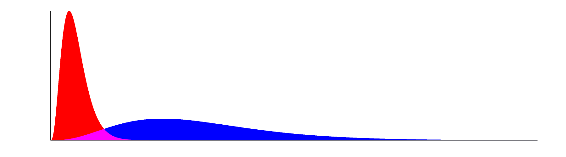
The graphs were inspired by the many "Flatten The Curve" graphics encouraging social distancing in response to COVID-19. Many of those graphs optimistically predict the flattened (lower-peak) curve having less area -- less total number of people infected -- than the curve with the higher peak. In contrast, the graphs above depict pessimistic scenarios in which the total number infected in both scenarios are the same, perhaps because the disease is so contagious that eventually 100% of the population always becomes infected. With a lower peak, the health care system is less likely to be overwhelmed (and less overwhelmed means fewer deaths due to shortages of medical resources), but the pandemic goes on for longer.
The function plotted is the probability density function of the gamma distribution. There was no scientific basis for choosing this function, other than it looks similar to Flatten The Curve graphics by others. The gamma distribution (with appropriate parameters) is a bell shaped function which starts at zero, has a peak, then decreases back down to zero asymptotically. The area under the curve is always 1 because it is a probability distribution function. The X axis (horizontal axis) limits were chosen so that 99.9% of the area under the blue (flatter) curve is visible on the graph.
In each graph, the red (higher peak) curve is the gamma distribution with parameters k=4 and theta=1. We chose these parameters to make it look nice and bell-shaped with a heavy tail to the right. (Higher values of k would make it more symmetrical.) This red curve has the same parameters in every graph; it appears more narrow when the X axis covers a greater range.
In the graph whose blue curve peak is 1/2 the height of the red peak, the gamma pdf parameters of the blue curve are k=4, theta=2.
Graph with (blue curve peak) = 1/3 (red peak): gamma pdf parameters k=4, theta=3.
Graph with (blue curve peak) = 1/4 (red peak): gamma pdf parameters k=4, theta=4.
Graph with (blue curve peak) = 1/6 (red peak): gamma pdf parameters k=4, theta=6.
Conveniently, 1/theta is the ratio of peak heights.
Functions were plotted with GNU Octave 4.0.0:
The peak function gives the location of the mode of the gamma distribution:
function y=peak(k,t)
y=(k-1)*t;
endfunction
function y=peakval(k,t)
y=gampdf(peak(k,t),k,t);
endfunction
>> [k1 t1 k2 t2]
ans =
4 1 4 2
We plot each curve separately, making sure to have the same axes between them.
t2=2 ; t=linspace(0,gaminv(0.999,k2,t2),1000) ; area(t, gampdf(t,k1,t1), "edgecolor", "black", "facecolor", "black") ; axis([0 gaminv(0.999, k2, t2) 0 peakval(k1, t1)], "tic[]") ; box("off")
print("fig2a.png")
t2=2 ; t=linspace(0,gaminv(0.999,k2,t2),1000) ; area(t, gampdf(t,k2,t2), "edgecolor", "black", "facecolor", "black") ; axis([0 gaminv(0.999, k2, t2) 0 peakval(k1, t1)], "tic[]") ; box("off")
print("fig2b.png")
Repeat for t2={3,4,6}.
The output dimensions of the images probably depend on the size on screen. Size on screen was the top half of a 1920x1080 display. Output image size was 3996x1010.
Bug in Octave: We tried "facecolor", "red", "linestyle", "none" to have a solid red area with no black border. The border disappears as expected when the figure is on screen but remains present in the "print" file. Ultimately, our workaround was to have Octave do everything in black and white, then add color in post processing.
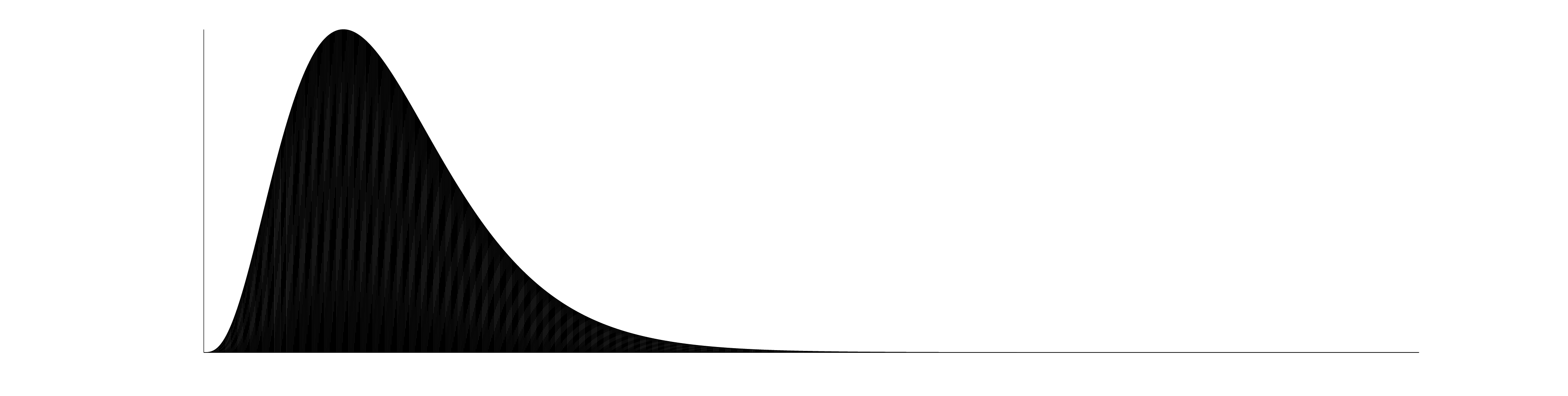
Bug in Octave: "print" fills the area with a strange moire pattern instead of solid color. We increase contrast to make it visible to the eye:
pngtopnm fig2a.png | ppmtopgm | pgmtopbm -thresh -val 0.0001 | pnmtopng > octave-moire.png
This might be an artifact of linspace sampling only 1000 points, but the output image being 3996 pixels wide. In the future, we will consider plotting a bar graph in Octave instead of an area graph.
We need a blank figure with just the axes.
figure
t2=2; axis([0 gaminv(0.999, k2, t2) 0 peakval(k1, t1)], "tic[]"); box("off")
print("axes.png")
We use NetPBM to composite pairs of curves onto one graph, adding color and black axes.
for file in axes.png fig*.png ; do pngtopnm $file | ppmtopgm | pgmtopbm -v 0.99 -thresh > $file.pbm ; done
for i in 2 3 4 6; do pnmarith -max fig${i}a.png.pbm fig${i}b.png.pbm >| c1; pnmcomp -invert -alpha fig${i}a.png.pbm red white | pnmcomp -invert -alpha fig${i}b.png.pbm blue | pnmcomp -invert -alpha c1 magenta | pnmcomp -invert -alpha axes.png.pbm black | pnmcut 198 5 3600 1000 | pnmscale 0.5 | pnmtopng > gamma-dist-$i.png; done
This script is pretty ugly. Surely there must be a better way to do this.
All images, including input images to the script (outputs from Octave).
Images are CC BY-SA 4.0.
No comments :
Post a Comment